Personas are not only created for a sales buyers’ journey to learn about the specific characteristics of your target market, but they’re also used for product marketing and to test usability of that product. The idea of ‘Build it and they will come’ is fine in the movies but for start-ups or any business we can’t assume that all users have the same knowledge of the product or how well they use it or even if they will like it; that’s why we test.
Here’s an example of our usability test for the trend page of our software…
 But first, a little history and our company background!
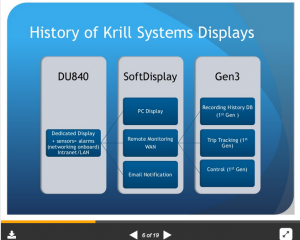
Our first product was a hardware computer display, a robust waterproof display that would collect sensor data throughout a local area network (LAN) and collect into a black box computer. Laptops became increasingly popular onboard recreational vessels, so we developed a software version. We continued to develop software but our customers directed our growth and soon our database and this history tracking page was key for long distance cruisers and even commercial maritime customers. Collecting real-time data of the vessel (or close to real-time, depending on Internet or satellite connection) allows users to predict behavior of equipment saving expensive cost of repair if monitoring is not achieved.
We should have seen it coming; our product was advancing and increasing in complexity but at this point our customers still wanted to be hands-on and install the product sensor set-up by themselves.
Eventually the company switched from a consumer after-market software into a commercial product requiring professional installation for commercial maritime users only.
This is the user experience test I initiated and performed that was particularly difficult to understand during installation. The engineers who designed the software could easily navigate the fields, but the customers were experiencing frustration out on the field.
Where were the hiccups during the installation process? Why were our customers being stumped? A fluid user experience is what we strive for and if not it can kill a product if the experience is less than stellar.
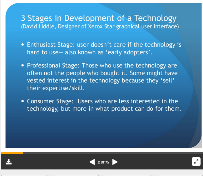
Based on David Liddle’s Three Stages in the Adoption Of A New Technology the we strived for the Enthusiast Stage, otherwise known as the Early Adopters.
I created our personas for this test based on our existing customers. Each persona (or group of users divided into groups of four) had a name and personality. Working jointly with the Engineering team and going out to the field we had to figure out what each persona’s preferences were, what were their computer experiences and what were their goals when using our software?
It’s important to brainstorm all these questions with customers to understand why they are purchasing the product and what they wish to accomplish when using it.
It is common that the designers (the engineers) may have a completely different view than the customers so I had to make sure that communication was clear and direct and during testing the designers could not be involved with the testing so not to alter or give hints to users.
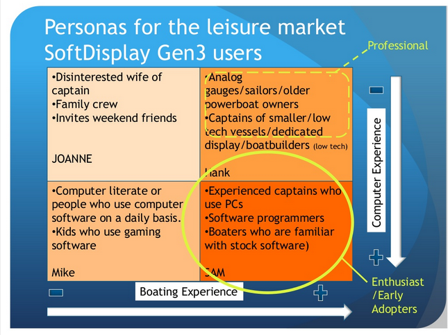
These were the characteristics of our recreational market personas. They were grouped into four personas and each were given a name. SAM was our Enthusiast/Early Adopters that we wanted to test. SAM had a high level of computer experience and were the very competent boaters.
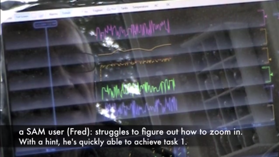
What better way to demonstrate what the customer is experiencing to the Engineers than showing a video of their own experience (and that’s what I did, I videotaped the testers while giving the UX test to do a few tasks on the page). You can view the video here, give me a call and I’ll send you the password.
 This is the graph which we should expect our product to see using Liddle’s Three Stages of Development of a Technology. The goad is to that over time a product should become easier to use as it reaches a mass consumer market.
Here are a few screenshots of the video user test. I added text to make it easier for Engineers to ‘hear’ the testers reaction. Also, because the video was long, I put some light music (Diana Krall’s “Don’t Know Enough About You“) to add humor and jovial entertainment.
Krill usability test 2009 from Lynne Watanabe on Vimeo.
If you would like to learn more about UX testing feel free to contact me.


